|
|
The Mask Text Input object is an app layout object found in the input .
|
 Attributes
|
|
The Attributes section includes the object name.
|
Name
|
Enter a name for the object. This is the name of the object as it will show in field chooser, the Navigation panel and other object lists.
|
|
|
We strongly recommend that each input object is given a suitable and unique name that reflects the data that will be held within it. The object name will, very likely, be referred to when adding behavior and workflow logic as well as when designing reports.
|
|
 Behaviors
|
|
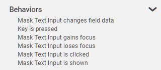
The Behavior section lists possible events on the object that can prompt a behavior to run.
|
Mask Text Input Changes Field Data
|
This event occurs when an app user enters data into the mask text input object.
|
Key is Pressed
|
This event occurs when an app user enters data into the mask text input object.
|
Enter key is pressed
|
This event occurs when the user's cursor, or focus, is in the mask text input object and the enter key is pressed.
|
Mask Text Input Gains Focus
|
This event occurs when the mask text input object becomes the active field.
|
Mask Text Input Loses Focus
|
This event occurs when the mask text input object is exited.
|
Mask Text Input is Clicked
|
This event occurs when an app user clicks on the mask text input object.
|
|
This event is different than Mask Text Input Gains Focus in that the app user must mouse-click on the object in order for the event to occur and any linked behavior commands to run.
|
|
Mask Text Input is Shown
|
This event occurs when the mask text input object is shown.
|
|
 Settings
|
|
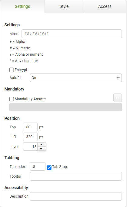
The settings section includes details of the mask applied, mandatory answer, positioning, tabbing, tool-tip and accessibility.
|
Mask Text Input Settings
|
Object
|
Details
|
Additional Information
|
[Input Format]
|
Enter a format for the input field. Options include:
•+ = Alpha •# = Numeric •? = Alpha or Numeric •* = Any Character
|
|
Encrypt
|
This feature is offered for an additional charge.
Click HERE to inquire.
Select this feature to encrypt the data when viewed outside of the app instance.
|
Encryption Details
|
Autofill
|
The autofill feature permits compliance with WCAG 2.1
|
The default value of 'On' will allow the field to auto-populate with frequently used data recorded in the app users browser.
|
Mandatory
|
Mandatory Answer
|
Select the Mandatory Answer check box to make the contents of the object required in order to submit the app instance.
You may enter a custom message in the text input below the check box. This message will be displayed if some part of the object has not been completed prior to app submission.
Click the ellipses button to display the Edit Mandatory dialog. Use this matrix to make the object mandatory based on conditions of roles and stages.
|
Marking as Mandatory
Checking for Mandatory Fields
|
Position
|
Top
|
Displays the object's location in from the top of the app (in pixels).
|
|
Left
|
Displays the object's location in from the left margin of the app (in pixels).
|
|
Layer
|
Indicates the layer number this object occupies. You can drag an object so that it fully or partially covers another object. Depending on the layer number it occupies, it may be positioned underneath another other object.
|
|
Tabbing
|
Tab Index
|
Indicates the order in the tabbing sequence that this object will be arrived at when the app user is using their Tab key to navigate through the app fields.
|
Tab Index
|
Tab Stop
|
Clear this check box to exclude the object from the tab order altogether.
|
|
Tooltip
|
Enter tooltip text to show to an app user when they hover their mouse over the object.
|
|
Accessibility
|
Description
|
Enter text that will be read aloud or converted to Braille for JAWS users.
|
Accessibility and JAWS Compatibility
|
|
 Style
Style
|
|
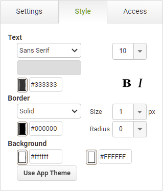
The Style section contains properties that control the font appearance and theme applied to the object.
|
Text
|
Object
|
Details
|
Additional Information
|
|
|
Select the font face for the caption text.
|
Fonts from the designers local machine will also be available provided the option to Use Custom Font has been selected in the Account Settings, however if the same font is not installed on the users machine then a standard font will be used to display the data.
|
|
|
Choose the size of the font for the caption text.
|
Manually enter font sizes smaller than the minimum selectable in the drop-down.
|
Color
|
Enter a Hex color code or click on the color box to pick a default color for the caption text.
|
|
|
|
Choose the style of the font for the caption text.
|
|
|
|
|
Select the border appearance type. Choose from None or Solid.
|
|
|
|
Choose a line weight for the border (in pixels).
|
|
|
|
Enter a Hex color code or click on the color box to pick a color for the border.
|
|
|
|
Select a numeric value to represent the curvature of the object's corners. The higher the number, the more curved the the edges of the object will be.
|
|
Background
|
|
|
Enter a Hex color code or click on the color box to pick a background color for the object.
|
|
Use App Theme
|
|
|
Resets the appearance options to the default settings configured on the app's Theme properties.
|
Applying or Resetting a Theme
|
|
 Access
|
|
The Access section contains properties for field state management.
|
|
To return to the Mask Text Input object details CLICK HERE.
Return to: App Layout Objects


