Password Input Settings
|
Object
|
Details
|
Additional Information
|
[Password]
|
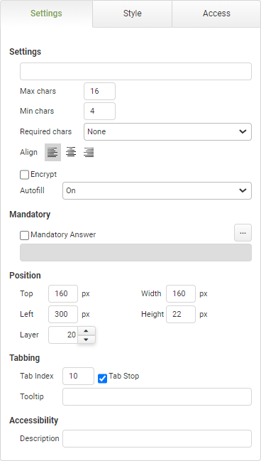
Enter placeholder characters if necessary.
|
|
Max Chars
|
Enter a value for the maximum number of characters allowed for the password.
|
|
Min Chars
|
Enter a value for the minimum number of characters allowed for the password.
|
|
Required Chars
|
Select any character requirements for the user's password. Options include:
•None •Alpha and Numeric •Alpha, Numeric and Special |
|
Align
|
Select the alignment of the text inside the password field. Options include:
•Align Text Left •Center Text •Align Text Right |
|
Encrypt
|
This feature is offered for an additional charge.
Click HERE to inquire.
Select this feature to encrypt the data when viewed outside of the app instance.
|
Encryption Details
|
Autofill
|
The autofill feature permits compliance with WCAG 2.1
|
The default value of 'On' will allow the field to auto-populate with frequently used data recorded in the app users browser.
|
Mandatory
|
Mandatory Answer
|
Select the Mandatory Answer check box to make the contents of the object required in order to submit the app instance.
You may enter a custom message in the text input below the check box. This message will be displayed if some part of the object has not been completed prior to app submission.
Click the ellipses button to display the Edit Mandatory dialog. Use this matrix to make the object mandatory based on conditions of roles and stages.
|
Marking as Mandatory
Checking for Mandatory Fields
|
Position
|
Top
|
Displays the object's location in from the top of the app (in pixels).
|
|
Left
|
Displays the object's location in from the left margin of the app (in pixels).
|
|
Width
|
Shows the width of the object.
|
|
Height
|
Shows the height of the object.
|
The minimum height is determined by the font size and cannot be less than 10px.
|
Layer
|
Indicates the layer number this object occupies. You can drag an object so that it fully or partially covers another object. Depending on the layer number it occupies, it may be positioned underneath another other object.
|
|
Tabbing
|
Tab Index
|
Indicates the order in the tabbing sequence that this object will be arrived at when the app user is using their Tab key to navigate through the app fields.
|
Tab Index
|
Tab Stop
|
Clear this check box to exclude the object from the tab order altogether.
|
|
Tooltip
|
Enter tooltip text to show to an app user when they hover their mouse over the object.
|
|
Accessibility
|
Description
|
Enter text that will be read aloud or converted to Braille for JAWS users.
|
Accessibility and JAWS Compatibility
|


